At Node-RED Con I spoke about the future roadmap of Node-RED, charting a course to the 5.0 release.
Previous major version releases have been done with the intention of aligning with Node.JS releases; as old versions reach their end-of-life, we do a major version bump of Node-RED to drop support of those versions. We haven’t been entirely successful in keeping to that schedule, and our overall release cadence has slowed down. It’s time to do something about that.
Rather than just do a 5.0 bump to update our Node.JS support, we wanted to take this opportunity to step back and reflect on what we could do to update the Node-RED user experience. The general look and feel of the editor hasn’t changed for a long time, aside from small tweaks. There are a lot of aspects of the editor that are taken for granted and often overlooked when thinking about improvements to be made.
This was one of the motivations behind the recent community survey - getting feedback from the community on what’s working and what could be improved, understanding how receptive users are to change in the Node-RED experience.
Evolution not Revolution
Building on the results of the survey, as well as our own discussions, we’ve identified four areas of focus:
- Node-RED UX Modernization
- Node Appearance Improvements
- Functional Enhancements
- Project Infrastructure Updates
Node-RED UX Modernization
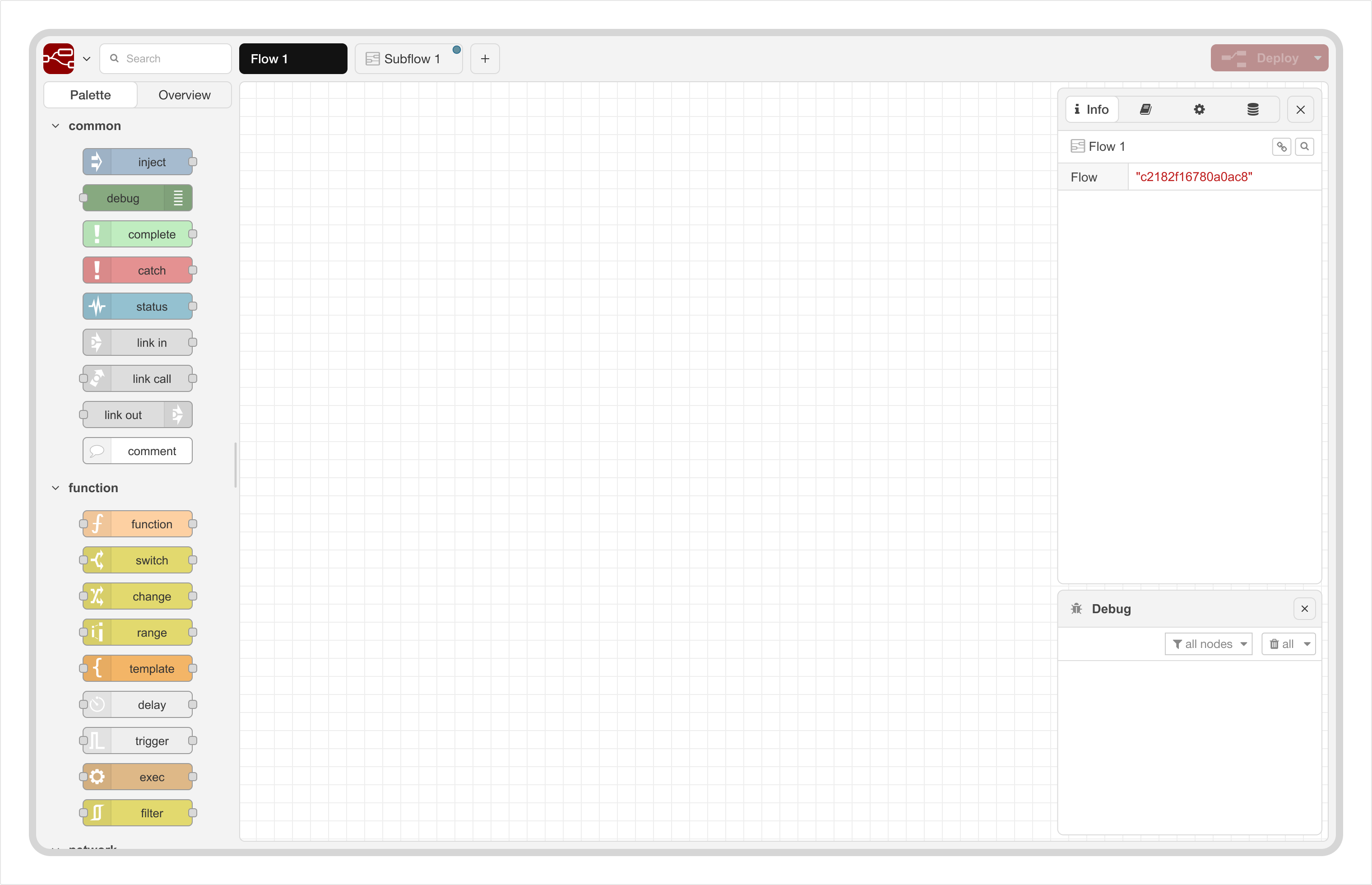
The Node-RED UI hasn’t changed much over the years. Comparing a screenshot from the very early days of the project with today, you can see a clear visual connection between the two, with the overall structure of the editor largely unchanged.
When we think about the information architecture of the of the editor however, some issues start to appear. Currently, we have the palette on the left, the flows in the middle and everything else stacked up on the right-hand sidebar. The sidebar has become a catch-all space for functionality to be exposed that doesn’t fit in the main workspace.
The Info sidebar provides an overview of all of your flows - a tree-view of all flows and nodes. But we still get feedback around making it easier to navigate around flows. In our Western convention of reading left to right, it would be far more natural to have this overview on the left-hand side.
Another piece of feedback was around the Debug sidebar; a common desire to have it visible whilst working on other things in the editor. The current UX forces you to chose one sidebar at a time - hiding away things you want to keep an eye on.
There is also the question of whether the UI makes the best use of the available space. We want to maximise the space available for working the flows.
Taking all of that into account, we’ve been putting together some UI mockups to see how this could look. It’s important to stress these aren’t ‘final’ designs - but are there to give a sense of direction and prompt feedback.
The full scope of the UX modernization covers a number of areas - some more obvious than others when looking at a static screenshot.
The highlights will include:
- Better information flow and navigation
- More flexible sidebar arrangements; allowing the user to position them on either side of the editor, or split them vertically
- Improved visual accessibility
- A built-in dark theme (this one appears to generate particular excitement)
Node Appearance Improvements
We’ve separated out the apperance of the nodes themselves as its own area.
The design of the node has changed very little since the early days of the project. Over time, various additions have been made (status text below, badges above). But there are some unsatisfied requirements we want to look at.
For example, some nodes have an implicit connection to other nodes; such as the Link Call, Status or Catch nodes. But this isn’t visually represented in anyway. This makes navigating those implicit connections hard to do and breaks the developer workflow.
Another area is how to better handle more custom nodes. At Node-RED Con we saw the work being done at Fluidly to create financial workflows in their custom Node-RED application. They have created a very rich visualisation capability within the editor workspace. Whilst that’s a level of customisation quite specific to their needs, there is clearly some interesting lessons we can learn here.
We already have community nodes, such as Image Tools that provide in-editor image previews. Currently that relies on “insider information” to inject the image into the workspace. If Node-RED were to change the internal workings of how flows are drawn, that would break the node. So we want to see how we can accommodate this type of customisation in a standard way - whilst keeping some design guidelines and control in place to ensure a good user experience.
Function Enhancements
There are some fairly targetted functional enhancements we also want to look at. They are a bit more open ended at this stage, but will build on the changes described above.
The main area here is looking at the debugging experience in the editor. The existing Debug sidebar is the backbone of figuring out what’s happening in your flows; but there is plenty of room for improvement, as evident from the many threads in the forum with questions, complaints and suggestions.
We will be working on a plan for how debugging can be made much easier. What lands in Node-RED 5.0 remains to be seen, but we should see some incremental improvements coming soon.
In terms of Node.js support, we’ll continue to support the current and active releases. The Node-RED 5.0 docker images we provide will be based on Node 24.
Project Infrastructure Updates
When we talk about modernizing the Node-RED experience, this isn’t just about the end-user experience. As an Open-Source project, we rely on developers contributing their time to make all of these plans a reality. We need to make it as easy as possible for new developers to contribute. With that in mind, there are various project infrastructure updates we want to make.
- Apply standard linting to the code base
- Move to npm workspaces for the repository structure. When we setup the current repository structure, containing multiple npm packages, there wasn’t a good solution available to manage everything. So we created our own structure and scripts to manage it. This has worked pretty solidly, but things have moved on and we want to re-evaluate. If there’s a good standard solution for this today, we want to consider moving to it so new contributors don’t have to learn “our way” of doing things.
- Replace our task runner with a modern alternative. This is the tool that manages the development environment, runs tests, creates release and many other tasks. It does its job, but it hasn’t updated for a number of years. There are many alternatives available - so we’ll be evaluating the right tool to move to.
- Improve our release process; automate more things to make the releases quick to do whilst ensuring a secure and trusted process.
Next Steps
We want to move quite quickly on this plan to get to a stable Node-RED 5.0 release early in the new year. Given the scope of changes being proposed, as with previous major releases, we’ll be publishing regular beta releases of Node-RED 5.0. That’ll start this week, with refreshes as updates are made. We really want to get community feedback along the way.
With this focus on getting to Node-RED 5.0, we will consider Node-RED 4.x in maintenance mode - it will continue to receive fixes for bugs and security related updates, but any new feature will target Node-RED 5.0.
If you want to follow the development work, this is the top-level planning item. From there you’ll find links to issues for different parts of the plan - some already raised, some to follow.
This is an exciting step for the Node-RED project; laying the ground work and refreshing the UX for the future.