Node-RED 5.0 is now available to install. If upgrading, please read the upgrade instructions.
Node-RED 5.0 is the biggest change to the editor experience in the history of the project. Back in our roadmap post we set out four areas of focus - modernising the UX, improving node appearance, targeted functional enhancements, and updating our project infrastructure. After a long run of beta releases - and a huge amount of community feedback along the way - we’re delighted to bring it all together in the final release.
We’ve highlighted the main changes below. As always, there have also been a large number of community contributions ranging from bug fixes, features, documentation and translations. We wouldn’t be able to do what we do without these contributions - a big thank you to everyone involved.
The Change Log has the full list of changes in this release.
- A modernised editor
- Functional enhancements
- Node and security updates
- Under the hood
- Full Changelog
- Community
A modernised editor
The general look and feel of the editor hadn’t changed substantially in a long time. With 5.0 we’ve taken the opportunity to step back and rethink how the editor is laid out, with a focus on better information flow, more flexible use of space, and improved accessibility.
This was a big, iterative piece of work, refined through the beta releases in response to community feedback. The result is an editor that should feel familiar, but makes far better use of the space available to you.
The modernised Node-RED 5 editor
Redesigned sidebars
Previously the sidebars were a catch-all space on the right-hand side, with the available panels hidden behind a hard-to-discover drop-down menu. Both sides of the editor now share the same, more discoverable sidebar behaviour.
The biggest change is that you can now show two panels at a time by splitting a sidebar vertically. This means you can, for example, keep the Debug panel visible in the lower section while working with another panel above it - a long-requested capability.
You can rearrange panels by dragging them directly between the available positions. Each panel has a small header showing its name that you can grab to move it around the editor - to either side, or into the upper or lower section of a side.
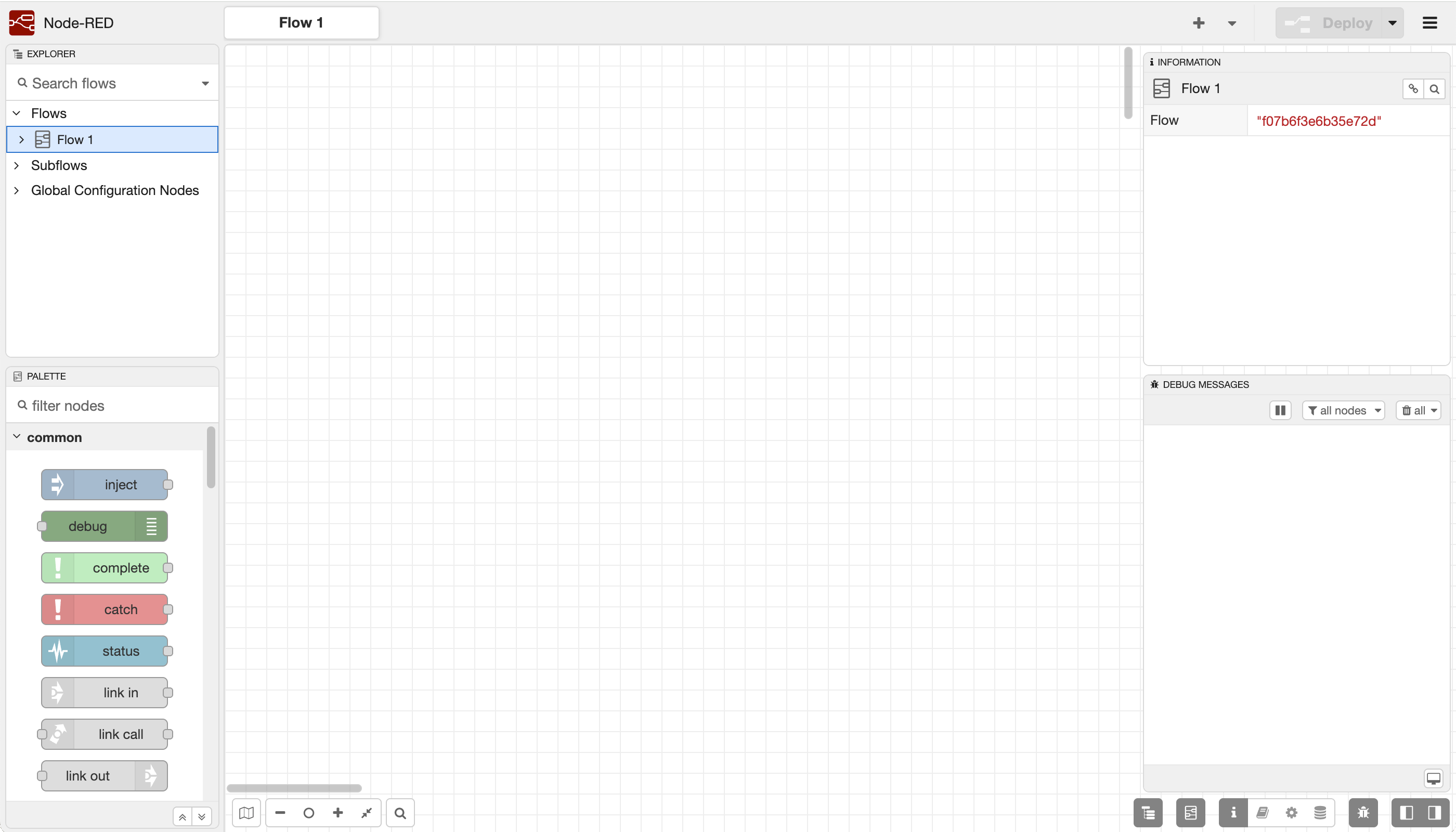
Along the bottom are the sidebar buttons, grouped by sidebar section, and toggle buttons to open and close the sidebars in a single click.
Sidebar toolbar
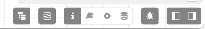
The Explorer and Information sidebars
The old Info sidebar has been split into two distinct panels:
- The Explorer lets you navigate your flows and nodes. In our left-to-right reading convention it’s far more natural to have this overview on the left, so it’s now the default panel in the top-left sidebar section.
- The Information panel shows details on whatever you currently have selected, and is the default panel shown in the top-right.
The Explorer and Information sidebar panels
Built-in Dark theme
Node-RED finally has a built-in Dark theme. The editor automatically picks the light or dark theme based on your browser/OS preference, and you can explicitly choose one in the User Settings dialog.
Node-RED 5 dark mode theme
Alongside this, we’ve added a mechanism for theme plugins to provide multiple variants - so a third-party theme can now ship both a light and dark variant in a single package, and have the editor switch between them automatically.
Accessibility improvements
Improved accessibility has been a recurring theme throughout this work. We’ve started applying appropriate ARIA attributes across the editor, the dropdown menus are more touch-accessible and scroll when there isn’t enough vertical space, and the theme has had a number of contrast and accessibility refinements. There’s always more to do here, but Google Lighthouse is much happier with us than it was before.
Updated selection appearance
As part of the accessibility improvements, selected nodes now show as a blue halo around the node, rather than just changing the node’s border. This makes it much easier to spot what’s selected, and clashes far less with the colour of the node body.
Node selection
Updated pan and zoom
We’ve updated various pan/zoom interactions withe workspace to better align with standard behaviours seen elsewhere.
As before, you can pan with the middle-mouse button. If you don’t have one, you can now hold the spacebar and drag with the left-mouse button to achieve the same result. There’s a new ‘zoom to fit’ button in the status bar that zooms your view so all of your nodes are visible. Pinch-zoom on touch screens is also much better behaved, and shift-scroll now works consistently across browsers.
Node documentation
Node that have additional documentation added under the description tab of their edit dialog now show a badge in the workspace. Clicking on the badge will show the documentation in a pop-up.
Node documentation badge
GitHub-style alerts in Markdown
The Markdown used throughout the editor - in node help, the Comment node, info text and more - now supports GitHub-style alerts. Adding a marker such as > [!IMPORTANT] or > [!WARNING] to a blockquote renders it as a highlighted callout. The Markdown editor toolbar also gained a button to help you discover and insert them.
Markdown editor including an Information alert
Other editor updates
- Search navigation now appears in a popover rather than expanding the status bar, so the status widgets no longer shuffle around as you step through results (#5744).
- The default palette categories now have description tooltips, and custom categories can provide their own descriptions via a theme plugin or node (#5769).
- Some missing core actions and keyboard shortcuts have been added and tidied up - including shortcuts to show the Palette (ctrl-g p) and Explorer (ctrl-g e) panels, and an action to toggle the Debug sidebar’s pause state (#5777).
Functional enhancements
Pausing debug output
A long-requested feature: you can now pause the Debug sidebar using a toggle button in its header. While paused, the panel stops scrolling and any new messages received are dropped.
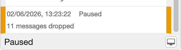
Pausing debug output
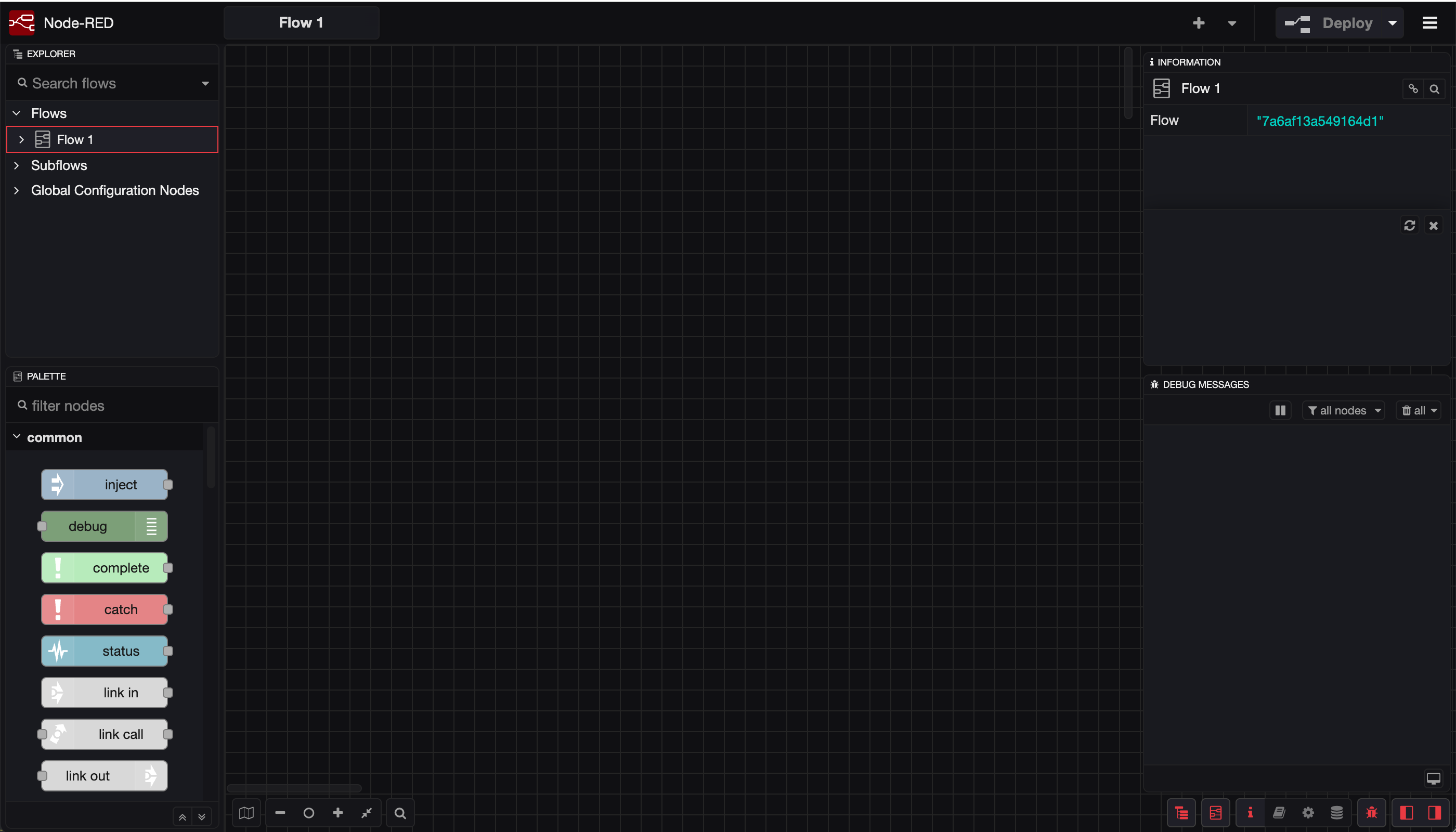
Calling Link nodes from the Function node
It’s now possible to call a Link node from the middle of a Function node and wait for a response to be sent back. For example, if you’d built a flow wrapped in Link nodes to handle database queries, you could call it from code with:
const { payload: data } = await node.linkcall('query-database', { query: "SELECT * FROM T1" })
The new API is exposed as node.linkcall. You pass it the name, or id, of the link in node to call along with the message to send it.
Fully details of the api are available in the Function node documentation.
Sorted node selection lists
The Link, Complete, Catch and Status nodes all present a list of other nodes to select from in their edit dialog. Previously this list was shown in the order the nodes were added to the workspace. It’s now sorted alphabetically by label, making it much easier to find the node you’re after.
Delay node burst mode
The Delay node’s rate-limiting mode has always spread incoming messages out evenly to the configured rate. It can now also be put into burst mode, where it lets messages through at whatever rate they arrive until the limit is reached - at which point it blocks them until the start of the next time interval.
Node and security updates
More TLS options
The TLS configuration node and several core nodes have gained more flexible options for securing connections:
- TLS certificates and keys can now be supplied from a PFX/P12 file (#4907).
- Certificates and keys can be loaded from environment variables (#5376).
- The HTTP Request node can now set the TLS SNI server name (#5667).
Hardened authentication
We’ve made a couple of changes to tighten up the editor’s authentication:
- OAuth logins now use a token-exchange pattern (#5657).
- The default admin CORS rules have been removed (#5652).
Other updates
- The Monaco code editor used by the Function node has been updated to the latest release (#5508).
- New credentials files are now created next to the flows file, rather than in the user directory (#4951).
- The WebSocket client now only connects when it needs to (#5533).
- The touch radial menu has been replaced with the standard context menu for a more consistent experience (#5614).
Under the hood
Node.js 24
Node-RED 5.0 requires a minimum of Node.js 22.9.0 to run - it will not run anything earlier.
However, keeping in mind the Node.js support scheduled, we recommend using Node.js 24, and this is what our Docker images are based on.
As the Node.js project no longer create 32bit ARM (arm/v7) based images, we are no longer able to support running on older Raspberry Pis (3b or earlier) as they cannot run the required 64bit OS.
Bundling npm
Previously, Node-RED relied on npm being installed and on the path for the palette manager to work. With this release, npm is now an explicit dependency of Node-RED. This gives us more control over how it’s used and closes some potential security issues.
Modernised developer setup
For contributors to the core code base, we’ve migrated away from the grunt task runner in favour of custom npm scripts. Grunt was the right choice 13 years ago, but the world has moved on - and now, so have we. This lets us drop a lot of unmaintained devDependencies from the project.
We’ve also moved off the long-dormant jshint to eslint. At this stage we’re not applying any new linting rules, but it lays the groundwork to do so in the near future.
Full Changelog
The full set of changes in this release can be found in the changelog.
Thank you to everyone who contributed to this release - we wouldn’t be able to do it without you!
Community
As an open-source project we are reliant on the contribution of the community. We have a strong and vibrant user community, well demonstrated by the activity on the forums. It’s great to see the support the community provides each other.
If you’re interested in contributing to Node-RED, now is a good time to come over and chat with us in either the forum or slack.